
You may have the numbers available after good research work, but you are not a financial expert, and your major challenge is how to present data in the most effective way without boring your audience. Then this Data presentation guide is for you. This article evaluates how to present data, techniques for data presentation, and useful tips for data presentation. Here is a complete Data Presentation Guide you cannot do without.
How to Present Data
Those with non-financial backgrounds or statistics will find data presentation complex and more challenging to their audience, but there is always a way around it for you. Here is how to present data by making your audience understand every detail.
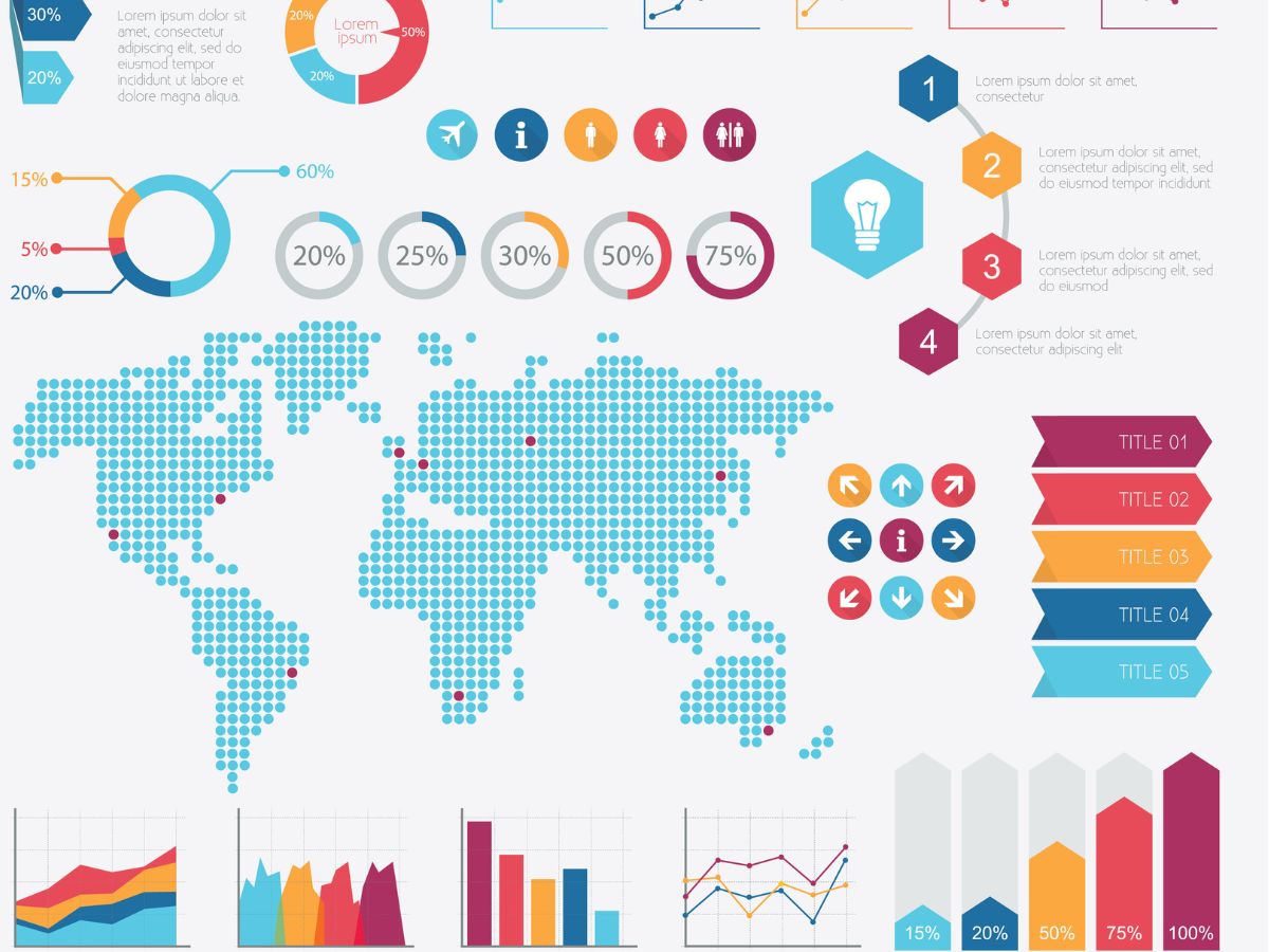
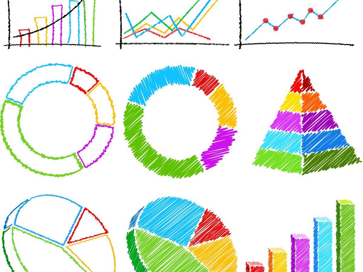
Use a Bar Chart:
You can present data in a bar chart. A bar chart is a representation of data in rectangular bars spaced evenly next to one another. It is usually data grouped together in the same category, with labels across the two axes of the chart. The heights of each rectangle depict the data each of them represents. A bar chart is a great data presentation technique. Logically, it can be understood by your audience as they weigh on the vertical axis.
Line Graph:
Line graphs are the same “L” as the Bar chart, but the vertical axis is most often the quantity data part of the graph, and the bottom horizontal represents dates or years of what you are trying to measure against the quantity. A stroked line running across the graph from the edge of the joint to the open source is mostly used to gauge the data you are trying to collect. Ahaslides says the stroked line can be more than one, especially when comparing more data in your presentation.
Images:
Data presentation has evolved with the era of social media, and if you consider how to present data to a social media-inclined audience, then using images is the jackpot. Images are more relative, and they stick in your audience’s mind. Visually, in one of their studies titled, “Visual Contents…” noted that the human brain is able to respond more accurately to visual content than plain text. And that the human brain stores images easily because it is able to grab the attention created by the image, process it, and be ready to present it back when the occasion elicits it. Breaking down data into relative images for your audience is one of the best ways to present data.
Heat Map:
The heat map is another technique to present data. It shows emphasis or intensity with brighter and deeper colors compared to fading colors which show less emphasis. As a United States citizen, major news outlets’ presentation of the election comes to mind. They assign a blue color to a candidate and a red color to the opponent to show which candidate is leading or has won a state. This presentation method is usable on your website to monitor where visitors frequent most, hot mapping the area of frequency with a deep color and fading out to areas less frequent.
Pie Chart:
The Pie chart is another data presentation technique to present complex data. The pie chart is a circle, marked in the middle with a dot or “meet point,” from whence the data is distributed across the circle in percentages. The perimeter within the circle is always 100%, from which data will be divided/sliced into the percentages they take up, usually demarcated with colors. However, you must be meticulous to ensure that the various data represented in the Pie chart slices sum up. They do not aggregate above 100%.
Text:
Are you thinking of how to present data in the simplest possible way? Then using the text method of data presentation is your way out. Only that this technique of data presentation leaves your audience with the major task of figuring out how to make meaning of the information presented. Text data presentation uses bullet points, numbering, or alphabets to list data. An example of text data presentation is listed below.
- 55% of event professionals say they prefer physical events in 2023. Bizzabo insights on in-person events, 2023.
- It costs 47.8% more to organize in-person events than virtual events. Zippia Event Industry Statistics, 2022.
- 41.5% of event organizers say they will pay as much as $5,000 to access technology for events to host virtual events in 2023.
Tables:
You can present data in rows and columns of a table to help in the easy arrangement and definition of your data. This technique of data presentation is quite simple and does not require ingenuity. Use Microsoft Tables, Google Sheets, or Excel to present data to your audience.
Useful Tips in Data Presentation
1. Share One point per data
Yeah! You have put in a lot of work, and you have all the information available, and the temptation is to present all the data to your audience. Kindly avoid doing that. That is called “Busy Chart” communication, opined by Scott Berinato, a Data Presentation expert. It is the impulse to show off to your audience that you have done a lot of work, and you want to throw all the details into their faces.
You must understand that you will end up confusing your audience if your data presentation slide is populated in such a manner.
Harvard Business Review’s cue is to ask what you want your audience to extract from a particular data presentation session. It will help you only display on a chart, table, or image only one point you would want your audience to focus on at a time, thereby allowing them to process the information and understand the point you are trying to make. Remember, the tip is one point per data shared. That is the first tip for presenting an effective workshop.
2. Choose colors for your presentation wisely
Not everyone is an artist, and you definitely were not born with the ability to select colors like a professional. But you need to choose colors for your data presentation wisely. Avoid loud colors and colors that do not mix or match. JotForm states that you should limit the number of colors in a data presentation, as many colors may become a distraction. Your data presentation slide should present data, not a painting festival.
Color Wheel helps with selecting harmonious colors. Invision provides the means of understanding the color wheel: the color wheel and finding complementary colors.
3. Do not mix charts or graphs except when you are comparing data.
One data presentation method per data is the general rule. Deviation from this rule is permitted only when you must compare data in the same category with different charts. An example is when a comparison is drawn between information in a pie chart and data in a Bar chart.
4. Rely on Feedback
If you are presenting data to a new set of audience, you must practice your data presentation in the presence of a colleague or friend before the main event. That way, you can seek feedback from them – if they understand your data, if anything is confusing, and whether there is a better way you can organize your data. Work on the feedback provided and practice the same process once more with the corrections effected.
Indeed suggest you work on feedback from previous data presentation sessions provided by your manager or attendees if you make frequent presentations of similarity. Applying the same rule helps to make your meetings more interactive.
5. Title your Data Presentation Method Appropriately
Apart from the clarity it provides, giving a title to your data presentation technique helps you organize your thought process and provides insight into what you are trying to communicate to your audience. A title such as ‘Bar chart showing the number of exhibition shows in Arlington, Texas,” is one of the ways you can label your chart, graph, or image. Title your ‘x’ and ‘y’ axes and any other diagram in the data presentation slide appropriately.
0 Reviews
Related Blogs

- January 16, 2025
- 2093
- 0
How to Plan Meaningful Community...
What are Community Events? Events held for the benefit and amusement of the community's members...

- September 12, 2024
- 2865
- 0
Upcoming Events Nearby me in...
There are numerous upcoming events nearby in Texas. These events span a wide range of...

- August 29, 2024
- 3275
- 0
How to Monetize YouTube Channel
YouTube is a platform used by both experts and novices to host videos. It's a...